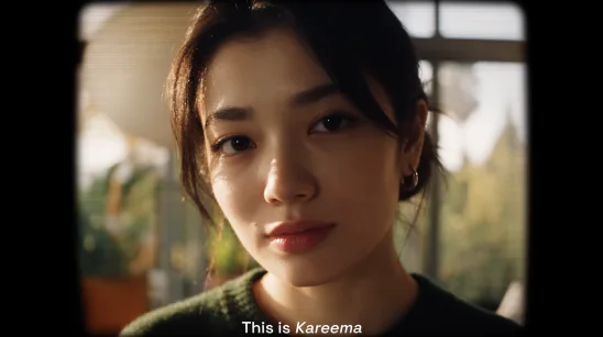
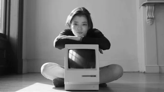
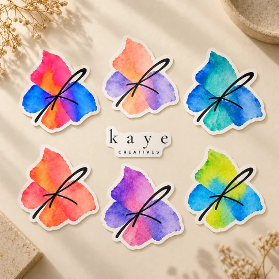
Kaye is the creative identity of Kareema Yertargyn, a musician, computer science engineer and creator working with AI filmmaking. The name brings together “Ka” from Kareema and “Ye” from Yertargyn. Often appearing as the protagonist in her own videos, she moves between imagined worlds, characters and visual styles. The identity needed to accommodate that range while keeping the person behind the work recognizable.
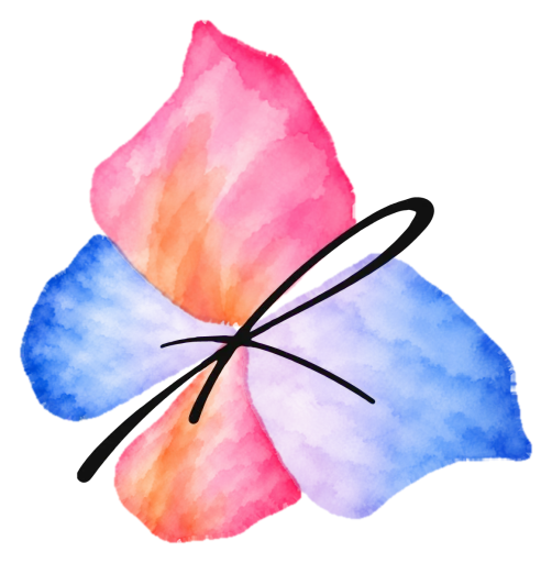
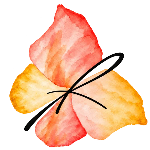
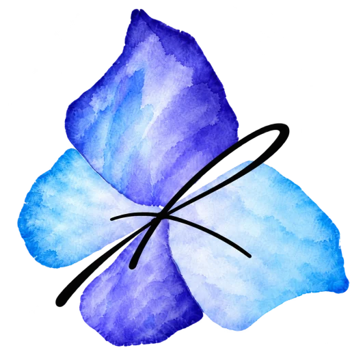
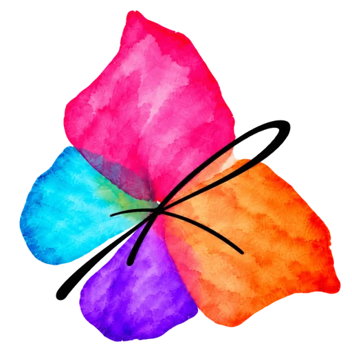
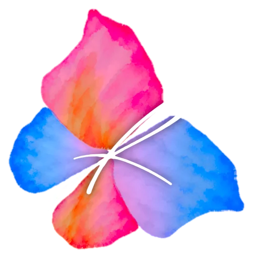
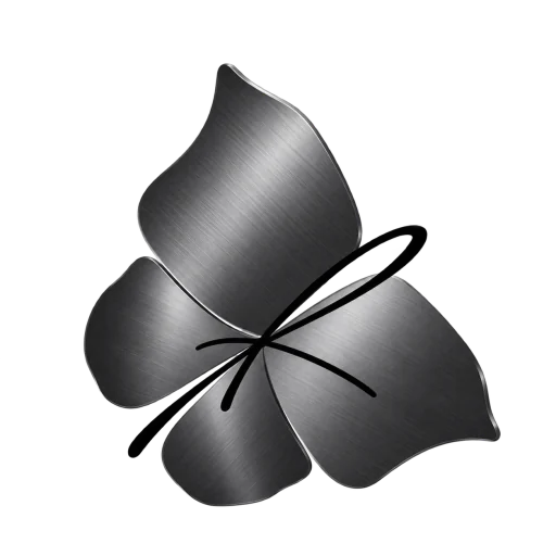
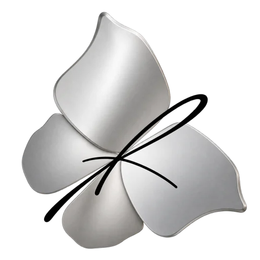
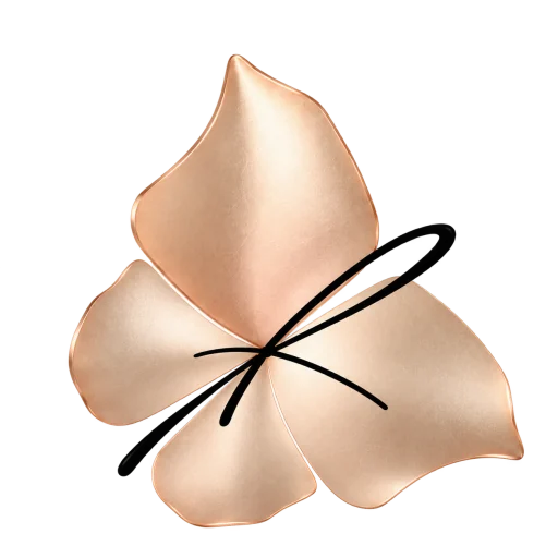
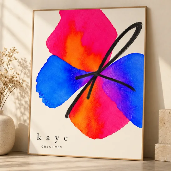
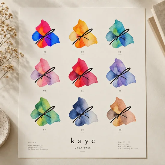
The butterfly gives this idea a form. Her initial K sits at its center, surrounded by four wings. Its familiar silhouette makes it recognizable, while the wings offer space to explore color, pattern, texture and movement. The original watercolor treatment gives the mark a tactile, handmade quality, bringing a personal touch to work made with digital tools.
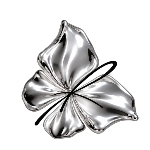
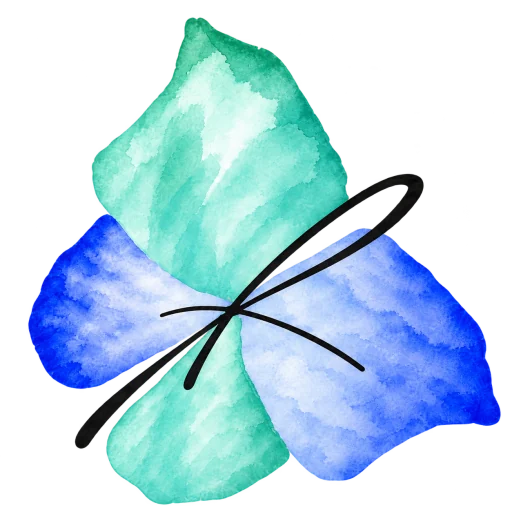
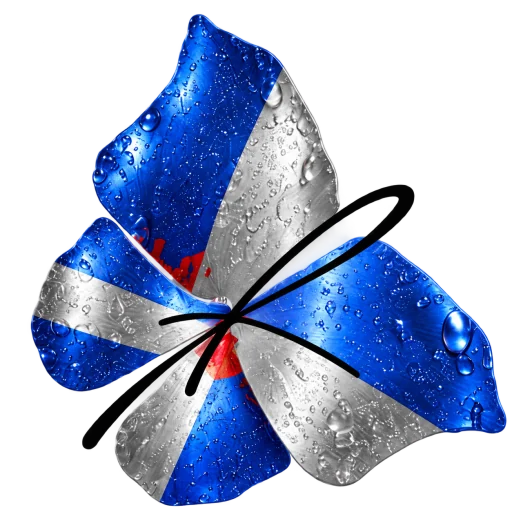
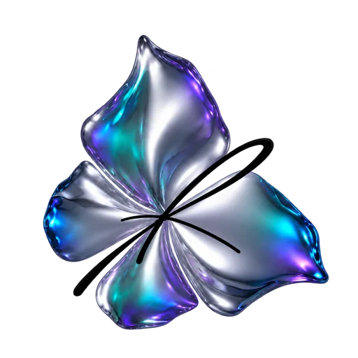
That balance between consistency and freedom runs through the system. The butterfly moves from translucent watercolor to sculpted studs, printed aluminum and reflective metal. A widely spaced lowercase wordmark provides a steady counterpart, with descriptors for Creatives, Music and Production. Shared proportions and spacing connect the variations, allowing the expression to change without losing its identity.
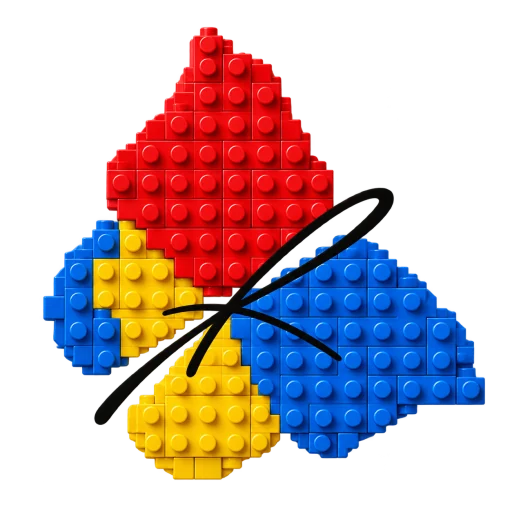
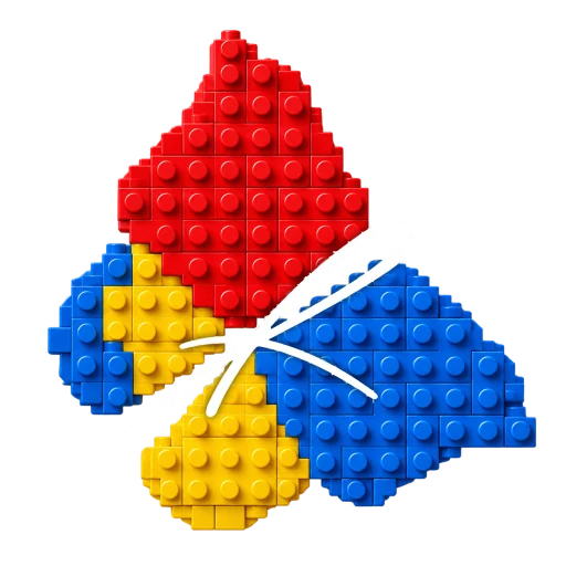
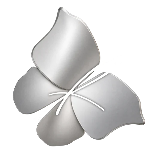
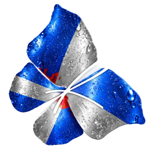
For brand collaborations, the wings become a meeting point between Kaye and a partner’s visual world. The examples explore LEGO through interlocking bricks, Apple through metallic finishes, and Red Bull through cobalt and silver. Partner lockups bring the names together while preserving the butterfly’s distinctive shape. Each application can take on a different character and still belong to the same family.
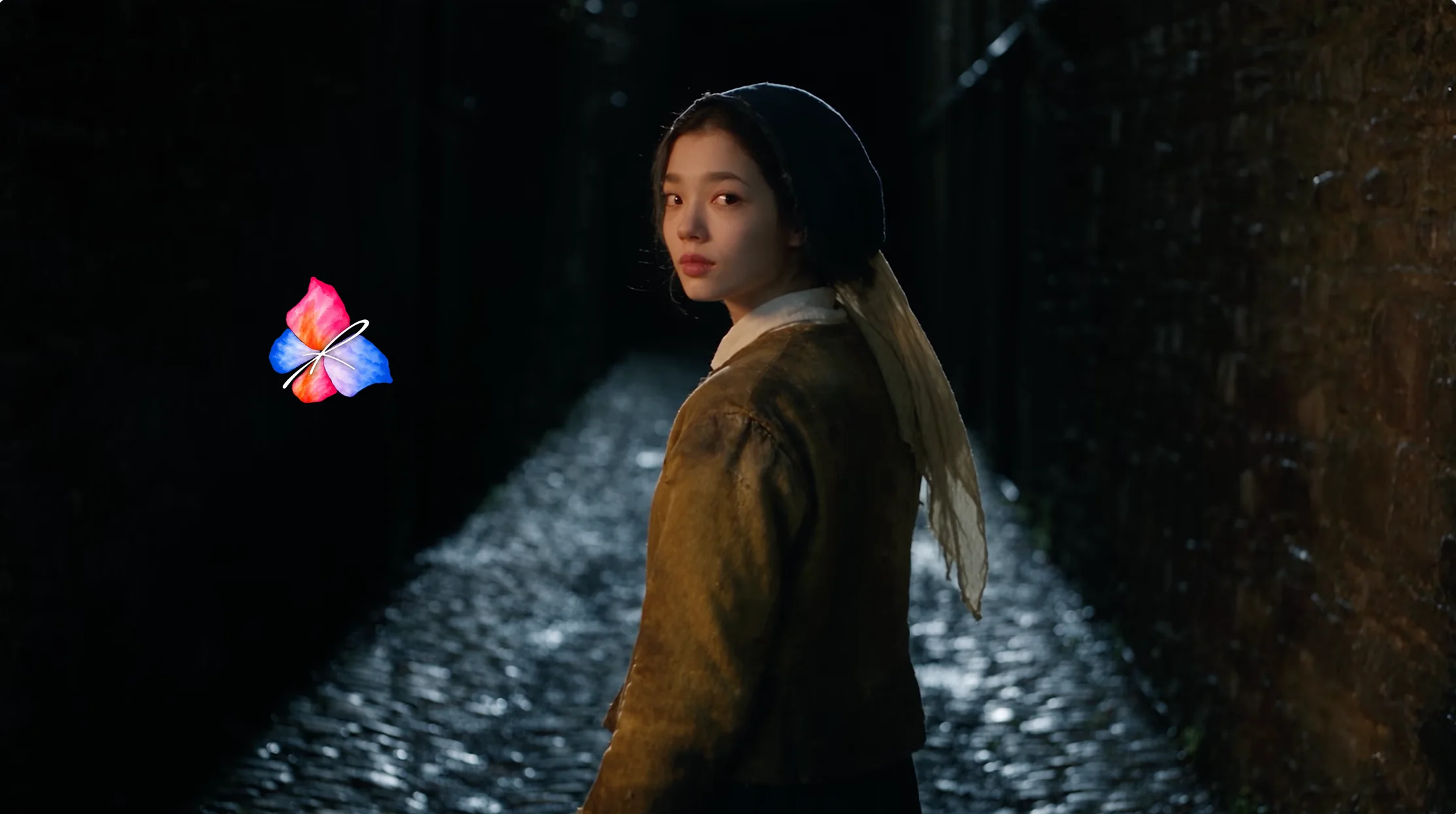
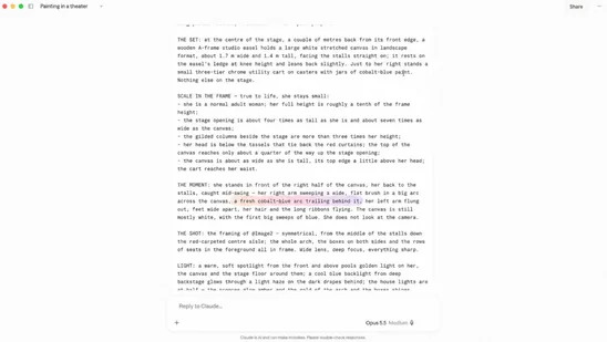
The identity is also tested in the worlds Kaye creates. Across cinematic portraits and commercial scenes, changes in color, scale, placement and lockup allow the logo to respond to the image around it. These applications show how the system can accompany different versions of the creator while connecting her work through a recognizable mark.
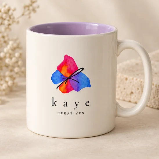
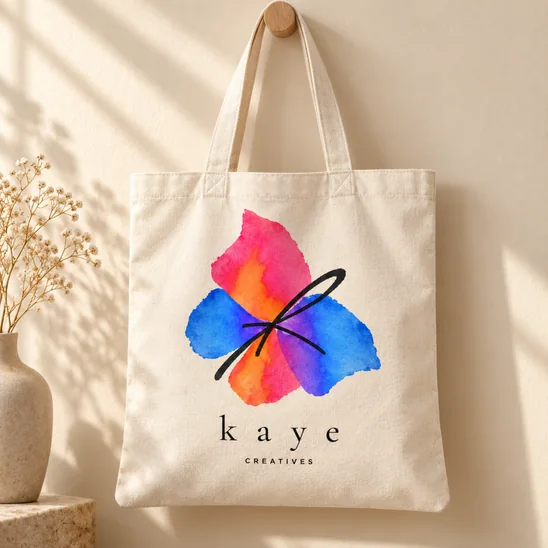
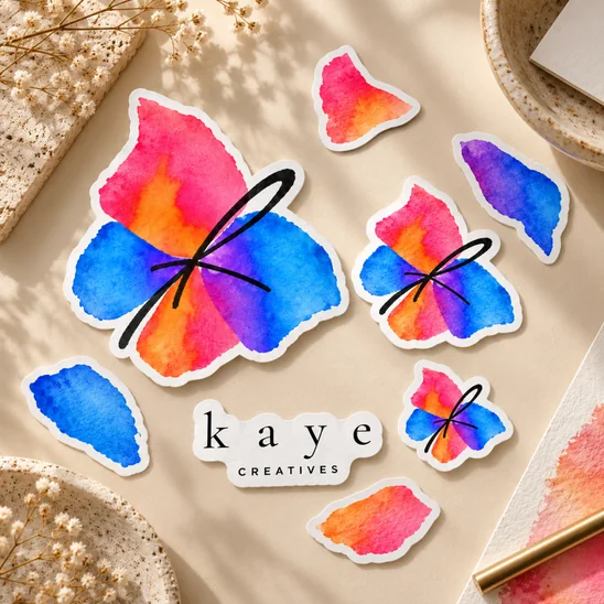
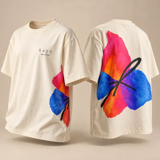
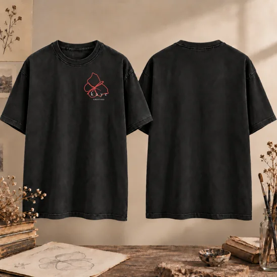
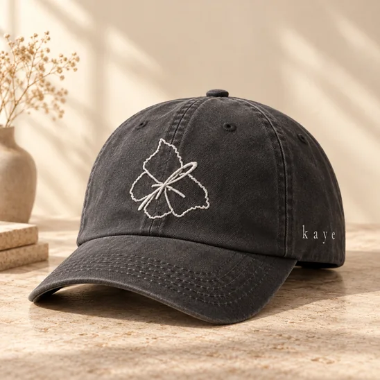
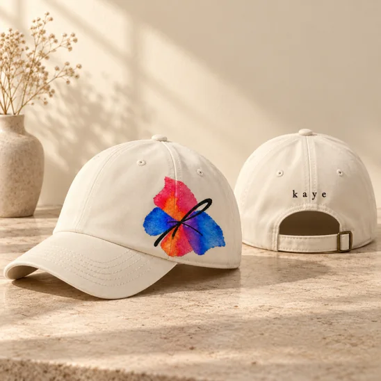
Beyond the screen, posters, clothing, mugs, totes, caps and stickers explore the identity as something to wear, carry and keep. Watercolor, outline and material-led treatments offer different expressions, from quiet signatures to larger graphic statements. The collection demonstrates how the same visual language can adapt to different surfaces and uses.
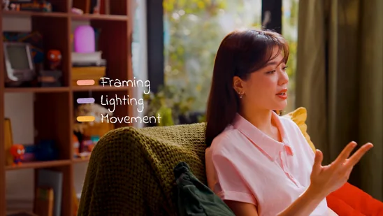
Motion extends the identity into Kaye’s educational YouTube videos. Text emphasis, click indicators and coin animations add small moments of brand character while drawing attention to key ideas and on-screen actions. They give her a practical vocabulary for explaining a process, marking a result or helping viewers follow a demonstration.
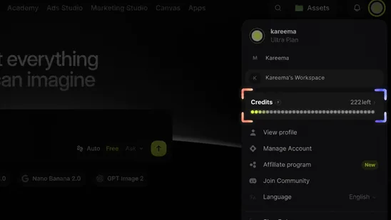
Motion Studio puts that vocabulary of change in her hands. She can choose a butterfly style, shape its movement and export a transparent video for her own edits. The identity becomes an ongoing creative tool: a consistent foundation with room to respond to whatever she imagines next.